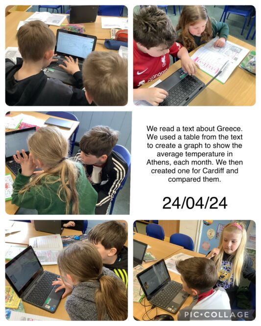
On the 24th April, we reread the text on the physical features of Greece. We looked at the table that showed the average temperature for each month in Athens. Using Excel, we inputted the data into the cells, altered the cells and created a line graph. We then looked for the same information for Cardiff and repeated the task. We were able to compare the average temperatures each month for both places. We looked for similarities and differences.

